Tuesday, September 9, 2008

Mercedes' Pocket Programs


When Mercedes contacted me for her wedding programs she said she wanted to use color. I showed her my pocket programs and she wanted to go with the same concept. We used her great fall color combo of orange and brown and used a floral graphic similar to what was on her invitations. I think I like how these turned out better than my own! 

Red Weddings


Red Weddings is a newly forming wedding planning and consulting business. They approached me to design a logo and identity system. They had a really well thought out and creative vision, they just needed a little help.

Shown above is the logo concept and several business card options. Final details are still in process but I wish Red Weddings much success!

Monday, September 8, 2008

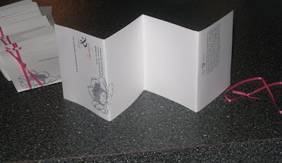
Program Pockets


Ok, so they aren't really pockets, but they fold up small enough to fit in one! I wanted to create something different than your average trifold or panel program. I love how the ribbon is crossed in front but creates two straight lines in the back.

Sunday, September 7, 2008

Extras!


Pink and Navy coordinating thank you cards, menus, favor tags, escort cards, table numbers, unity candle and out of town bag tags.

Friday, September 5, 2008

Polka Dots and Peonies!


These invitations slowly evolved from many different ideas. I decided on the fresh, funky, yet classic colors of hot pink and navy blue. My wedding flowers were peonies and I found a great peony graphic I was dying to use. I have a general love for circles and dots so out all of those things my invitations were born!

There is no inner envelope, a pink belly band was used to indicate guest's names. A wrap label was a fun solution to addressing the very dark navy envelopes. The pieces were printed in raised ink (thermography) at my favorite print shop DaSilva Printing.

Thursday, September 4, 2008

Rehearsal Dinner Invitations


I loved this project! It is simple black type on white linen paper with rounded corners. A silver shimmery "folder" is tied together with pink ribbon. I love the peep hole detail allowing a monogram to show through.

Shower Invites


My sister and Mom were throwing my shower but asked if I would like to do the invitations, why of course! I couldn't pass it up even though I had about 3 million other things going on at that point. I based this cute purple-green-dot-design off something similar that I had seen online. It is a simple panel with coordinating ribbon tied at the top.

Save The Dates


Welcome to my brand new blog! Check back often for new paper happenings! The first several posts will be of my own personal wedding paper. 

At the time that I was doing my save the dates I hadn't fully developed my vision for what I wanted the rest of the paper to look like. I have a very simplistic style and wanted to use an engagement photo. This was the final product sent out as postcards.